Somatic Snuggie
“Technology that can interact with the body in more caring and sensorial ways”
Project Summary
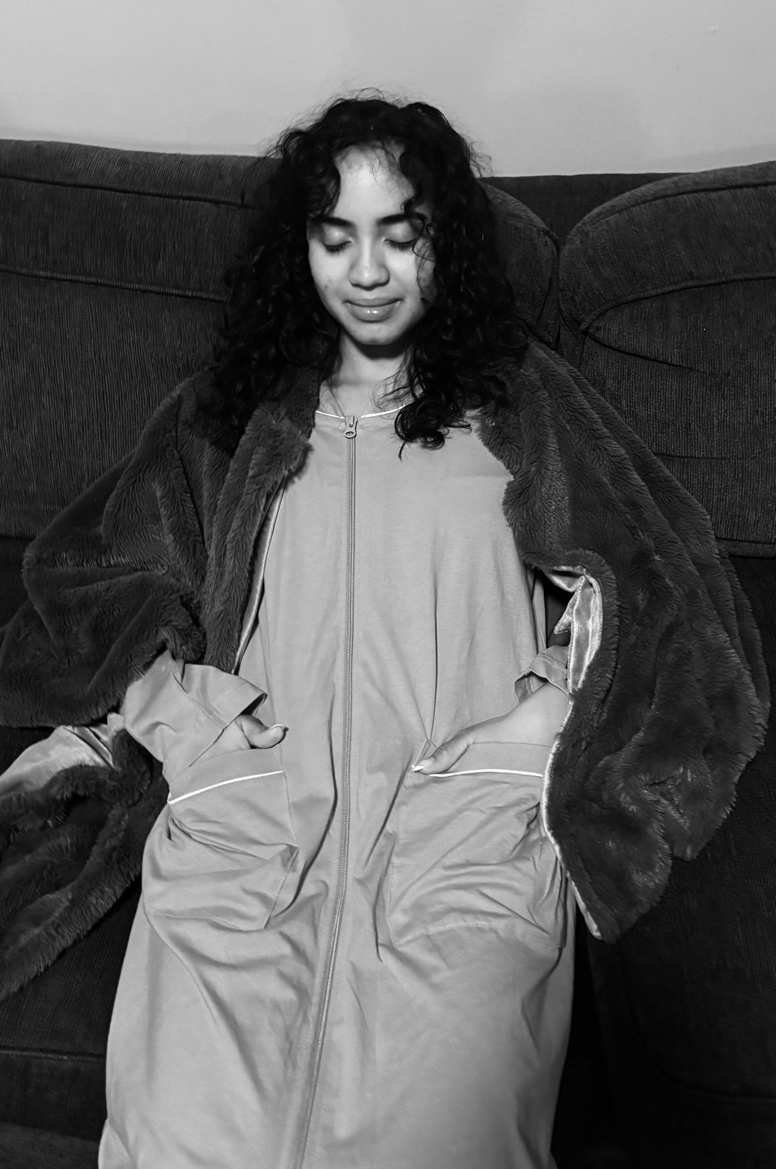
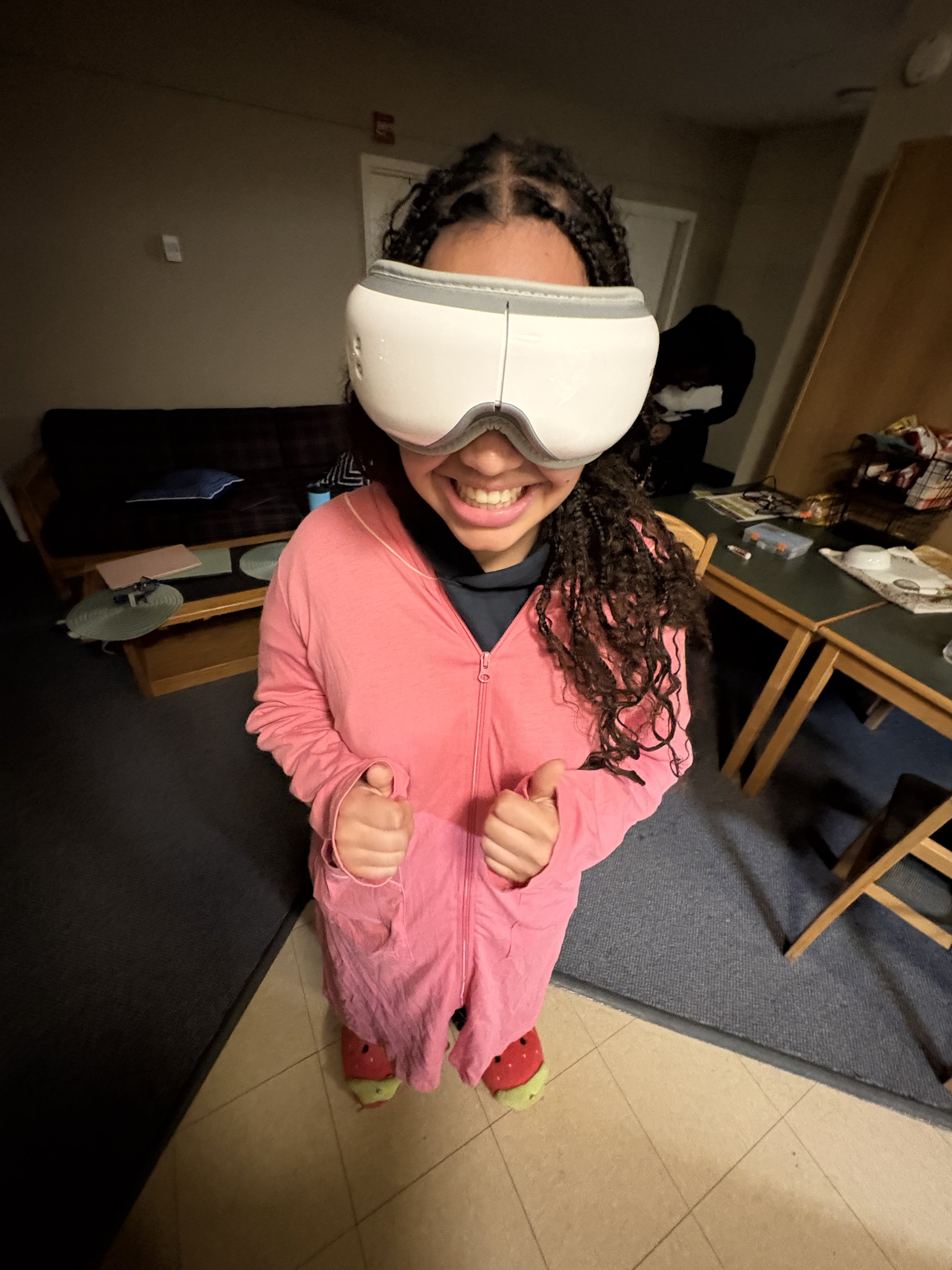
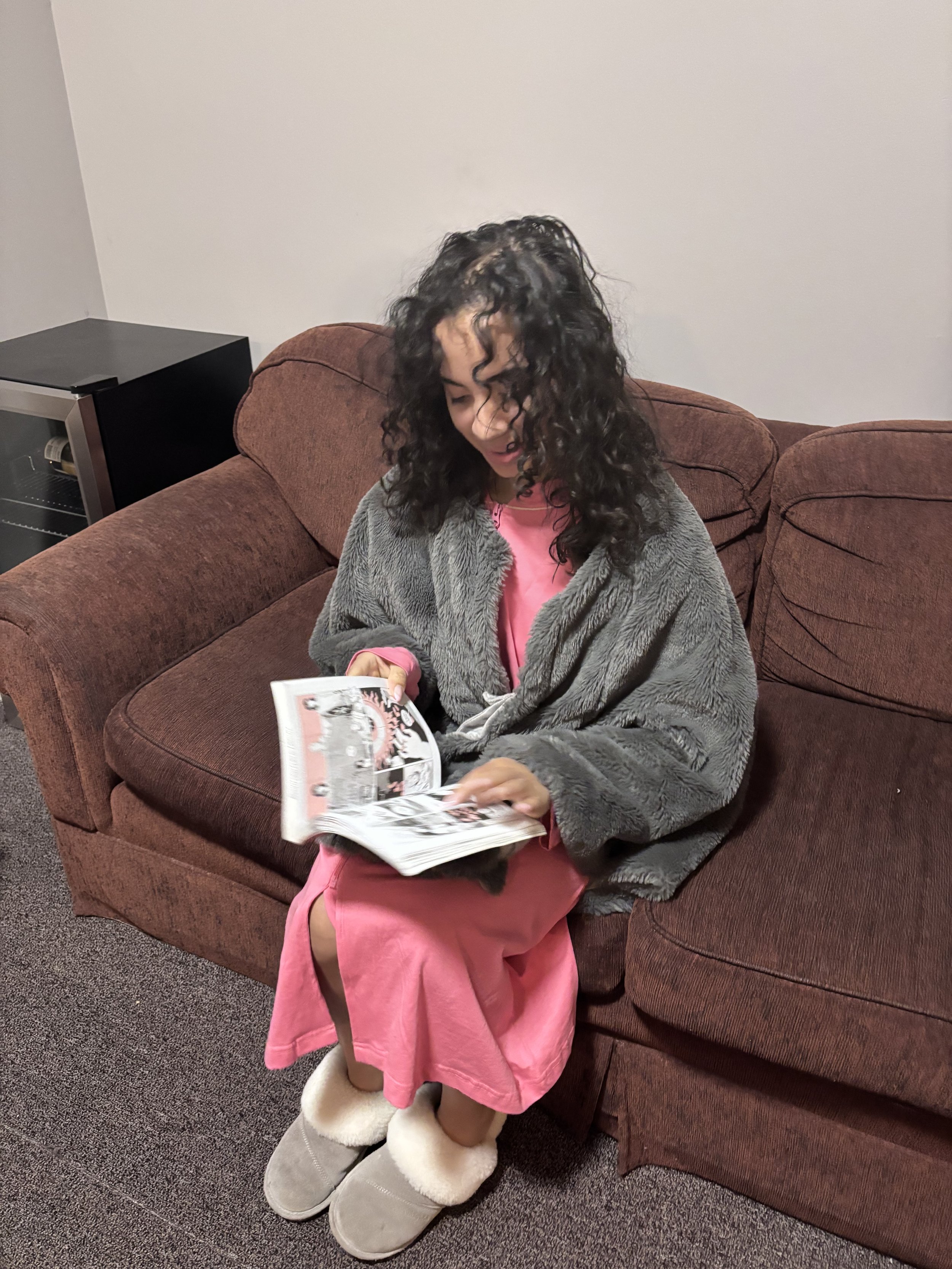
The Somatic Snuggie project explored how design can support relaxation in a world where people are constantly exposed to screens. Across SDP1 and SDP2, our group focused on creating a sensory experience that encourages users to slow down and feel more present.
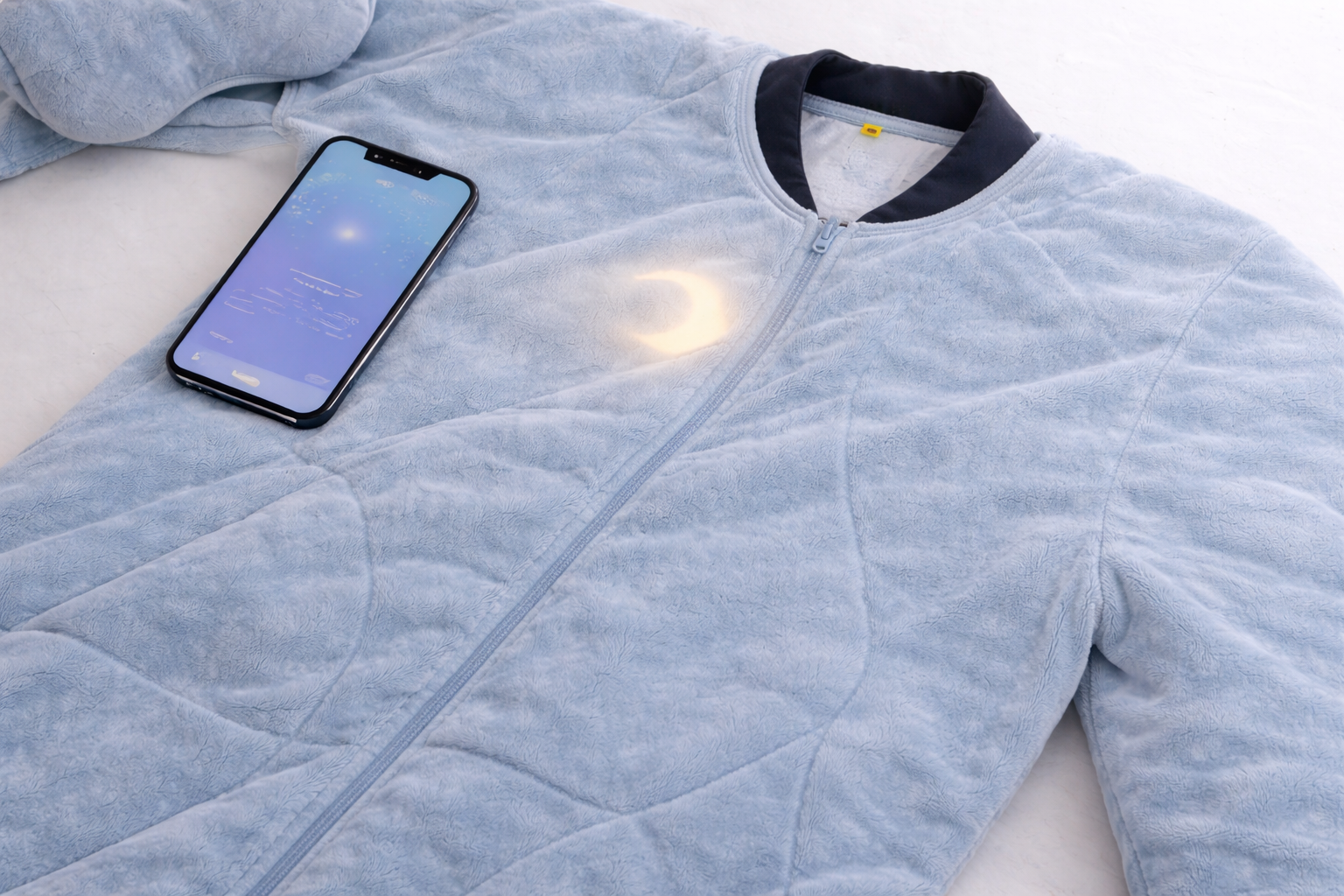
Over time, the project developed into a concept that includes a wearable suit, an eye mask, and a companion app used after the experience. The main goal was to design something that feels calm, simple, and grounded in physical interaction, rather than adding more digital engagement.

Design Problem + Role
One of the main problems we focused on was how difficult it is for people to disconnect when many wellness tools still depend on screens and constant interaction. These solutions can sometimes make the experience feel more overwhelming instead of calming.
To respond to this, our project focused on creating a more physical and sensory-based experience. In this project, I contributed to shaping the direction of the concept and refining how the user would experience it. I also supported the group in organizing ideas and making sure our design decisions stayed focused on solving the problem.
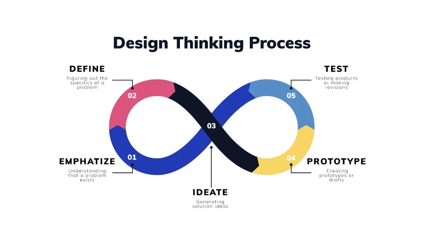
Design Process
The design process began by exploring how people experience stress, fatigue, and digital overload in their daily lives. This helped us recognize that many existing solutions still rely heavily on screens, which influenced our decision to move toward a more physical approach.
During the ideation stage, we explored a variety of concepts. While some ideas were creative, they were often too complex and difficult to translate into a clear user experience. This became a challenge, as it was not always obvious how users would interact with them. To address this, we made the decision to simplify our direction and focus on one stronger idea: a wearable concept built around touch and vibration.
As we moved into prototyping, we focused on how different parts of the concept could work together. One design decision that worked well was keeping the companion app separate from the main experience and using it only for reflection afterward.
Feedback played an important role throughout the process. It helped us identify what was not working and pushed us to make the design more clear, focused, and easier to understand.
Final Insights and Reflection
The final design was successful in creating a more clear and calming experience by focusing on simplicity and physical interaction. One of the biggest improvements came from moving away from more complex ideas and developing a concept that felt more realistic and user-friendly.
At the same time, some early ideas did not work because they lacked clarity and were difficult to understand from a user perspective. Working through those challenges showed the importance of refining ideas over time.
Overall, this project helped me develop a stronger understanding of how design decisions affect user experience and how thoughtful, simple solutions can often be the most effective.