Region of Waterloo – Digital Service Playbook
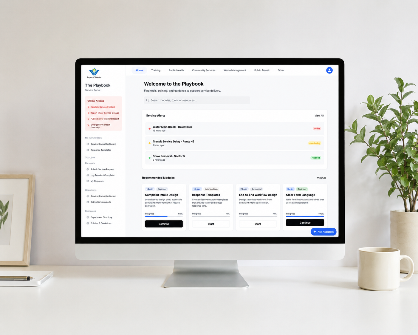
The Region of Waterloo lacked a centralized platform for service design training, resulting in inconsistent workflows, confusing navigation, and inefficient onboarding for staff. Our team designed a Digital Service Playbook to improve how employees learn, access resources, and complete common service tasks.
The solution combines structured learning modules, intuitive navigation, quick actions, and search functionality into a single platform that promotes consistency and reduces errors. Through user research and usability testing with Region of Waterloo employees, we identified key usability issues and refined the design to better support both new and experienced staff.
The final prototype improves task efficiency, builds user confidence, and provides a scalable foundation for future digital service training across the organization.
Nature's Calling UX Writing Redesign
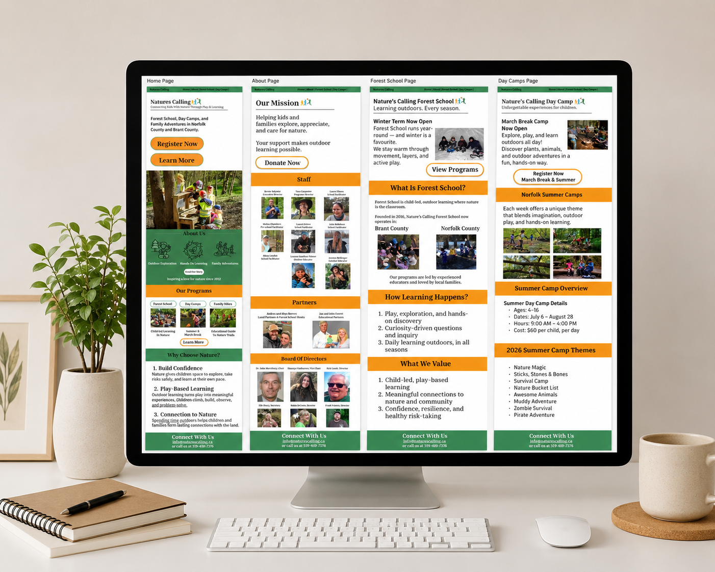
Nature's Calling is an environmental education organization that offers forest school, day camps, and outdoor learning programs for children and families. While the organization provides valuable services, its website presented information through lengthy text blocks and dense layouts that made it difficult for parents to quickly find the information they needed.
The objective of this project was to improve the website's usability through UX writing and information architecture. I restructured content, simplified language, and strengthened the visual hierarchy to create a more intuitive browsing experience without compromising the organization's mission or credibility.
The redesign focused on the Home, About, Forest School, and Day Camps pages, reducing the site's content by approximately 85% while preserving essential information. Clear headings, concise copy, stronger calls-to-action, and improved page structure allow parents to quickly understand programs, compare options, and confidently register their children.
The final design delivers a cleaner, more accessible experience that supports faster decision-making and better reflects Nature's Calling's welcoming, family-focused brand.
Visual Communication Through Type
This project explored how typography alone can communicate a powerful message without relying on illustrations or photography. Using Adobe photoshop, I created a poster that demonstrates how scale, perspective, hierarchy, and composition can transform simple text into a compelling visual narrative.
The design is centred around the quote "Success Doesn't Come to You. You Go to It." To reinforce this message, I used the repeated word "DIFFICULT" to construct a three-dimensional staircase leading toward the word "WIN."Every element was built using typography and Illustrator's vector tools, allowing for precise control over alignment, spacing, perspective, and scalability.
This project strengthened my understanding of typographic hierarchy, visual balance, and conceptual design while improving my proficiency in Adobe Illustrator. It demonstrates how thoughtful use of type can communicate emotion, movement, and meaning through design alone.